
Case study Rising Sons
An identity that sells the beer before you open it
Rising Sons is a craft brewery from Cork with a character you couldn't see on the shelf. We built an identity and a packaging system that win at first glance — from the logo down to the label.
- Client
- Rising Sons
- Year
- 2025
- Industry
- Craft brewery
- Scope
- Logo Branding Tone of voice Product design
Context
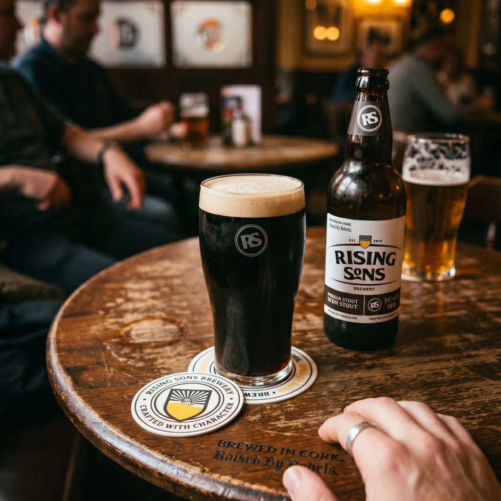
At the pub on Cornmarket Street, Rising Sons sells itself — atmosphere, people and the beer do the work. The problem started on the retail shelf, where the bottle competed with dozens of other craft brewers without a distinctive logo or a coherent packaging series.
The challenge
Every Rising Sons brew has its own character and its own fans. The brand needed a system that keeps the family resemblance across the series while letting each beer tell its own story — without designing everything from scratch at every launch.
+38%
growth in retail sales after the rebrand
6
packaging lines in one system
2×
faster shelf launch for a new brew
The process
We built the rebrand around what is most true about Rising Sons: the sun in the name and the port heritage of Cork.
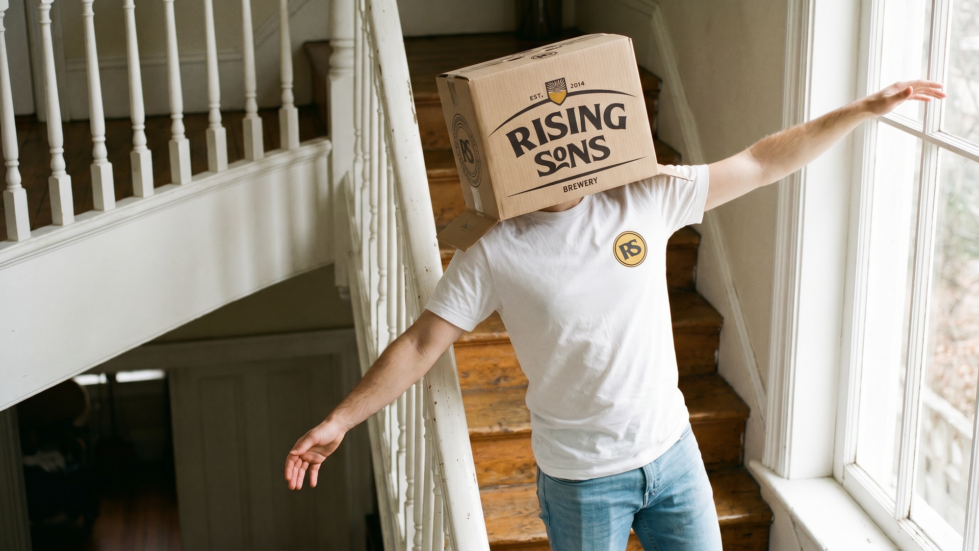
- a new logo — a sun rising over the waterline, readable from a metre away and from across the street,
- a label system: fixed grid and typography, palette and illustration changing per brew,
- a tone of voice with Irish wit — on labels, coasters and social media,
- merch and pub signage designs that complete the brand world.
The solution
On the shelf the series works as one organism: the rhythm of the layout attracts from afar, and up close every label rewards you with its own story. A new brew gets its livery in days, not weeks — the system does the work, the designer adds character.
Results
The brand stopped being Cork’s best-kept secret. Distribution expanded into new outlets, and the packs now work as mini-billboards wherever they stand.
People buy our beer on looks and come back for the taste. It used to be just the taste.
the Rising Sons team